20 April 2007
It's Now or Never
Since about 2 weeks, French people were able to see official campaign posters next to schools, our voting places for one day (this Sunday).
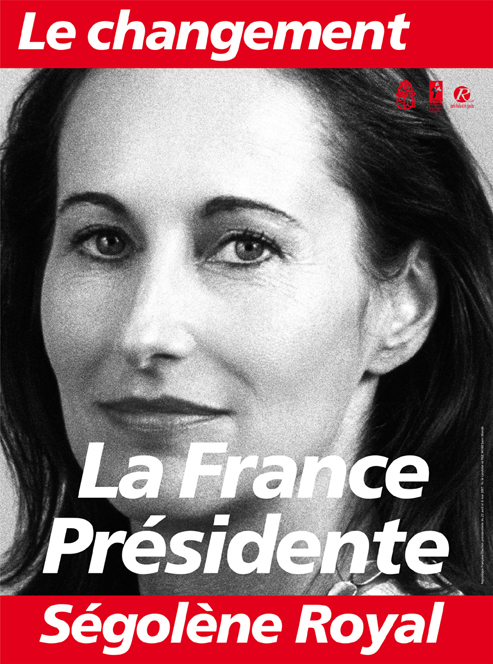
The only poster among the 12 out there that really stands out is Ségolène Royal's. It has a very simple, yet effective design: her picture is in white and black, and her slogan "Le changement: Ségolène Royal" is written in white on a red background.
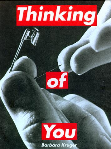
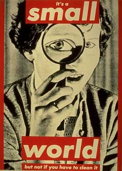
The 1st time I saw it, one name popped into my mind: Barbara Kruger.
The aesthical similarity is almost too strong not to be done in purpose. And honestly, that only gives more points to my favorite candidate. This poster is clearly a statement, refering directly to a feminist and strongly political-minded artist and opting for radical design in general is quite a bold and modern move.
We'll know the results of the 1st round on Sunday. Hoping for the best...

--Joëlle
The only poster among the 12 out there that really stands out is Ségolène Royal's. It has a very simple, yet effective design: her picture is in white and black, and her slogan "Le changement: Ségolène Royal" is written in white on a red background.
The 1st time I saw it, one name popped into my mind: Barbara Kruger.
The aesthical similarity is almost too strong not to be done in purpose. And honestly, that only gives more points to my favorite candidate. This poster is clearly a statement, refering directly to a feminist and strongly political-minded artist and opting for radical design in general is quite a bold and modern move.
We'll know the results of the 1st round on Sunday. Hoping for the best...


--Joëlle
Labels: Barbara Kruger, Elections, Politics, Ségolène Royal
